Different Types of Logos
What is a Logo?
Logo is a term used to refer to a symbolic image that is designed for a company that is meant to be a visual representation of their brand. There are two main classifications of logos; Type focused logos and logos with both type and symbols. Below I’ll go into seven types of logos.
Wordmark/Logotype
This form of logo is one of the simplest ones as it only involves the company’s name in a stylized type. Normally this logo form is selected by companies with short names. An example of the Wordmark logo that I really like is the Vans logo. Created by the son (Mark Van Doren, 13 at the time) of one of the co-founders, James Van Doren. The intent was to have the logo be able to be made into a stencil which could then be used on skateboards.
Another example is one that I never liked was the logo for ‘Bing’ from 2009 - 2013. The reason being that it looks like it the designer chose a simple sans serif font and only stretched it out. A company as big as Microsoft should have the capabilities to come up with a better design (at the time)
Monogram/Lettermark
Monogram logos consist of one to four letters and are usually the initials of the company’s name. A lot of times this form is opted for when the name of the company is long and/or the intent is to have modern, eye-catching visuals.
An example of a Monogram logo that I like is the iconic ‘HP’ logo. This one stood out to me because it perfectly portrays an innovative Tech company.
A Lettermark Logo that I do not like is the new KIA rebrand. This is due to the poor legibility of the letter’s IA, which is easily confused for an ‘N’. Now the logo makes it look like a completely different company.
Combination
Combination logos merges a wordmark with a symbol. It’s one of the most common types of logo due to its adaptability since the symbol alone can be used for specific purposes and the combination can be useful when necessary.
An example of a Combination logo that I like is the amazon logo. I think it’s a great logo that covers the mission and brand identity of the company. The curved arrow extends from a to z, representing how the company can provide anything to their customers while also keeping them satisfied.
There isn’t really a combination logo that I can think of that I don’t like, the majority of designs of this type of logo tends to be simple and straight to the point to not be too busy.
Abstract
Abstract logos use unique symbols, colours and/or fonts that typically are not necessarily related to anything specific. This particular type of logo is suitable for companies that want to stand out with an eye-catching design.
A popular example of this type of logo that I like is Unilever’s. At first glance it appears to just be the letter ‘U’ in a random pattern but then the closer you look you’ll notice that the pattern is a group of icons that represent the brand’s values.
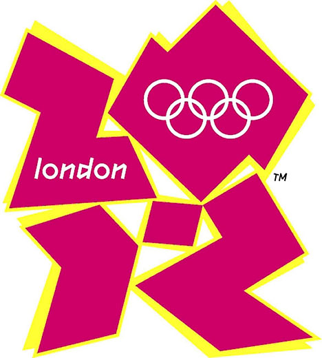
Whilst looking at other examples however, I came across the infamous London 2012 logo. There was major controversy surrounding the design. But the reason I dislike the logo has to do with the colour choice. I understand that abstract is meant to stand out, but I think the designers may have done too much.
Brandmark/ Pictorial
Pictorial logos are made up solely of an image or symbols and do not include the company’s name. This form of logo can be great for brands that already have built their brand recognition but will be a bit risky for new businesses that have yet to put their name out there.
A brand mark logo that I like is the Target logo. The bullseye symbol gets straight to the point and perfectly complements the name of the company.
On the other hand, I came across MasterCard Worldwide’s rebrand logo and felt the opposite. To me the original was good as is and the new version seemed unnecessary.
Emblem
Emblem logos are considered one of the older forms of logos. These consist of symbols and/or text encased in a container (often a crest-like shape). Usually companies that want to portray a sense of authority, tradition and stability.
One emblem style logo I have always liked is the Mini Cooper Logo. It keeps the vintage style while also having a gist of modernity.
During research I encountered the logo for the United States Department of Justice. I personally don’t think that it looks bad, however I do think that as a logo it’s not really scalable.
Mascot Logos
Mascot logos incorporate an illustrated character that is meant to be the representative of the brand. This type of logo is often used in children brands as they convey a fun and friendly nature.
This may be biased but one of my favorite snacks growing up was Pringles, which has an iconic mascot logo of a man with a mustache.
One design I didn’t like however, was the rebrand for the MNMs. For a company that distributes a popular snack, they took the route of trying to go politically correct despite their audience not asking for it. In the end it felt very forced and took away from characters that we all loved growing up.
Sources:
Looka. (2020). Different Types of Logos: Which One is Right for Your Business? [online] Available at: https://looka.com/blog/different-types-of-logos/.

.jpg)


Comments
Post a Comment